
Happy Father’s Day!
Leave a reply
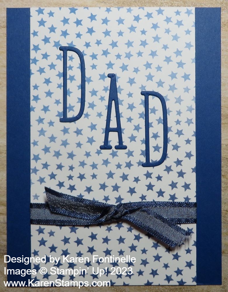
Sunday is Father’s Day so make sure you have a card ready for the special man/men in your life! Here is a super simple Dad Card For Father’s Day.
The card base is Blueberry Bushel, one of the returning colors in the Stampin’ Up! Color Refresh in May. I liked this layer of Bright & Beautiful Designer Series Paper with the little stars for this card. The stars have the ombre effect as you go down the card. I cut the paper the full length of the card but narrower. It’s 5 1/2″ x 3 1/4″. Before adhering it to the card base, I added a piece of the Night of Navy 3/8″ Bordered Ribbon around the bottom of the card and tied a knot onto the ribbon separately. After attaching the ribbon, I adhered the this piece to the card base.
I used the Alphabet A La Mode Dies to cut out the word “DAD”. I used Blueberry Bushel cardstock for the letters. Now, if you don’t have this alphabet die set, see if you have some other alphabet set that you could stamp. If you do, stamp on Basic White cardstock, either for the whole word or each letter. You could cut rectangles for each letter so that the stamping would show up on the card.
If you wanted to, you could add some punched or die cut additional stars on the card.
That’s all there is to this card, so if you need a last-minute Father’s Day card, perhaps this card will give you some ideas or you can simply copy it!
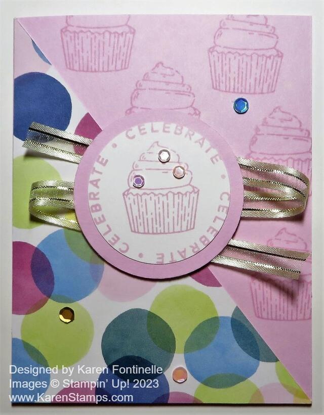
Make this Bright & Beautiful Diagonal Birthday Card for anyone’s birthday! The paper makes it festive and bright and of course, who doesn’t love a cupcake?
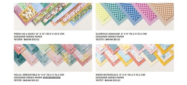
This Bright & Beautiful 6″ x 6″ Designer Series Paper is a great package to own. You can purchase it at a 15% discount right now through June 30th! It has bright and beautiful colors and designs, just like the name says! So many coordinating colors with this paper, also. Some papers are like ombre-dipped shades, then there are stars, dots, diagonal stripes, circles, confetti, and more. Use it for cards or scrapbooking. For sure, the papers go well for making birthday cards.
The card base is Bubble Bath cardstock. If you want to have some stamped images on the side without designer paper, be sure to do that before you add the designer paper. I just stamped the cupcake from the Circle Sayings Stamp Set in Bubble Bath ink on the Bubble Bath cardstock. That gives a watermarked look, the same as if you used Versamark ink instead. It just adds a little interest rather than the blank cardstock on that side.
To cut the designer paper on the diagonal, first decide what size you want it to be. If you want it to fit corner to corner, completely against the fold of the card and all the way to the bottom of the card, then cut a piece of designer paper 4 1/4″ x 5 1/2″, the exact size of the card. Then cut it diagonally from corner to corner with your Paper Trimmer. Put the top left corner of the designer paper even with the Paper Trimmer cutting track while also putting the lower right corner of the paper also even with the cutting track. That puts your paper on the diagonal. To avoid tearing the corners when you start cutting, place the cutting blade up into the paper, then back down to the corner, and then go up to the top, or vice versa. That takes some of the pressure off that pointy corner of the paper with the cutting blade jamming into it.
If you want the card to have the usual margin, cut the paper at 4″ x 5 1/4″, then adhere it 1/8″ off the fold and from the bottom as you would normally do. Either way is fine, or even smaller, depending on your design.
For the center greeting, I stamped the words and the cupcake from the Circle Sayings Stamp Set on Basic White with Bubble Bath ink. I punched it out, which was very close, with the 2″ Circle Punch. I wanted to use the 2 3/8″ Circle Punch for a layer of Bubble Bath so I had to use the 2″ Circle Punch. It worked fine!
I added Stampin’ Seal to the back of the greeting circle so that I could wind the Gold & Vanilla 3/8″ Satin Edged Ribbon back and forth behind it, and then I added Stampin’ Dimensionals to hold down the ribbon and to pop up the greeting in the center of the card. I liked the touch of gold on a festive birthday card!
And what birthday card would be complete without some bling? I used the Pastel Adhesive-Backed Sequins here and there on the cupcake and card to some sparkle. I have used these sequins a lot, maybe because the colors go with a lot and because they already have adhesive on them, unlike sequins we used to have that we had to glue down ourselves.
You can use this same card design with the other images in the Circle Sayings Stamp Set or even use some other greetings and dies. Here is another card I made recently using the same paper and stamp set, but with a few differences.
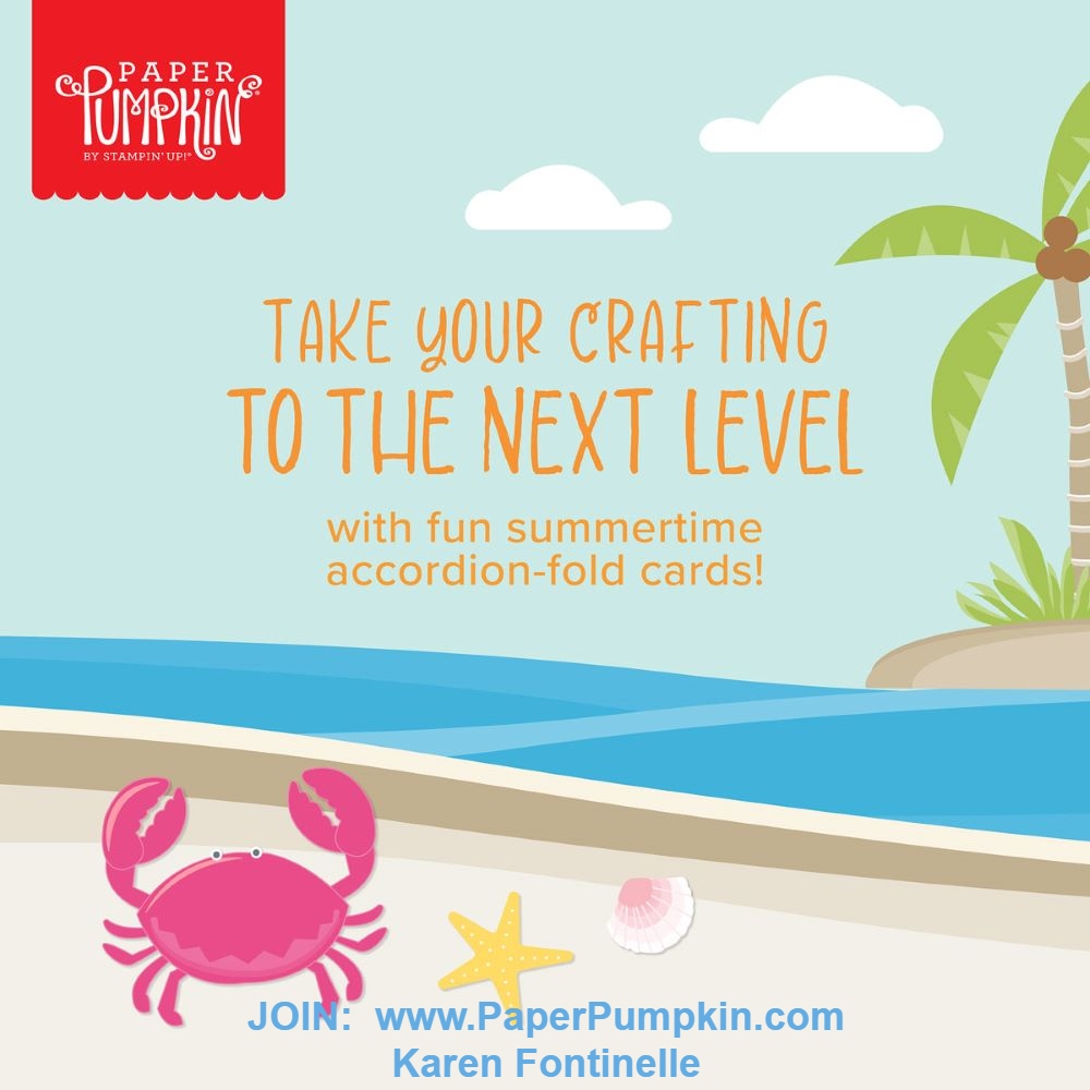
Say hello to summer and get crafting under the sun with this month’s Paper Pumpkin kit! With beach designs, fun accordion-fold cards, along with sentiments to support, encourage, say hello, and more, wave at those you love through uplifting cards and send family and friends oceans of kind words all summer long!
Paper Pumpkin is a monthly subscription, so you will find the gift of a Paper Pumpkin Kit to yourself in your mailbox each month! Usually, it is a kit to make cards, but it can be something else. All the supplies for the project are included in the box, even wrapped in tissue paper just like a gift! No risk, no obligation to continue for any length of time. Skip a month now and then if you need to. Stampin’ Up! guarantees each kit.
ABOUT THE KIT
Name: Fun in the Sun
Coordinating Stampin’ Up! colors: Azure Afternoon, Basic Gray, Crumb Cake, Daffodil Delight, Flirty Flamingo, Granny Apple Green, Melon Mambo, Pool Party
This kit includes:
This looks like a fun Paper Pumpkin Kit to me! If you have skipped any months recently, make sure your account is active so that you will receive this kit mid-July.
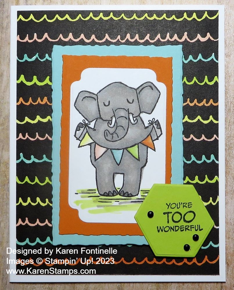
If you are looking for a whimsical card for Father’s Day, this Zoo Crew Father’s Day Card might do! If you don’t have “official” masculine stamp sets, look through your stash because you will find something you can use! Maybe just change the colors to make a card look more masculine if that’s what you want.
I thought it would be fun to try to make a Father’s Day card using the Zoo Crew Designer Series Paper with all its cute, whimsical characters. Depending on who you are giving the card to, the page with the celebratory animals, like for a birthday, might work the best. But if you have a hiker, camper, or outdoorsman, the page with those images would be perfect.
This elephant holding a colorful banner seemed like it would work for a Father’s Day card. I diecut the elephant with a die in the Something Fancy Dies. Then I layered it on two Deckled Rectangle die cuts, one in Pumpkin Pie cardstock and one in Pool Party cardstock.
Once I decided on this scalloped wavy line pattern for the card background, I decided to color each line with a color in the elephant’s banner. I used Stampin’ Blends in Lemon Lolly, Petal Pink, Pool Party, Lemon Lime Twist, and Pumpkin Pie. I really like the look of the colored lines. The elephant is colored with the Gray Granite Stampin’ Blends.
After layering the elephant and the two rectangle layers together, I popped it up on Stampin’ Dimensionals. For the greeting, I used one in the Zany Zoo Stamp Set and then die cut with the hexagon shape die in the Something Fancy Dies. I stamped it a little off-center by accident, but since “there are no mistakes in stamping” I just added a few black Classic Matte Dots.
If you need a Father’s Day card for Sunday, you don’t need everything to be masculine and specific for Father’s Day. See what you have and just choose something you can use. It’s the thought that counts!
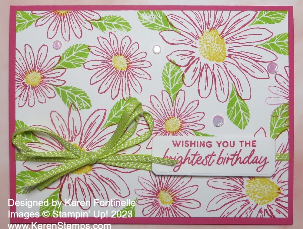
Sometimes it’s fun to stamp your own images on a card instead of using die cuts or designer paper! It’s like getting back to basics and it feels so good to have that stamp in your hand and stamp over and over!
This card is very simple. I chose a Melon Mambo cardstock card base with a Basic White layer. Of course, stamp the white layer before adhering!
I used the Cheerful Daisies Stamp Set to stamp three of the largest daisies and then filled in the rest of the space with the smaller outline daisy stamp. For the flower centers, I used Daffodil Delight ink. There is a smaller flower center stamp and a larger one. Of course, flowers need leaves, so I inked up the leaf stamp with Granny Apple Green ink and filled in wherever I could.
The ribbon tied around the card is the Lemon Lime in the Ribbon Duo Combo Pack. To make the bow a little more substantial, I used two strands of ribbon and tied a bow.
The greeting is in the Cheerful Daisies Stamp Set and is stamped in Melon Mambo ink. It is diecut with the small banner die in the Countryside Corners Dies. For a final touch, I added several pink Pastel Adhesive-Backed Sequins.
This is just a fun, simple card to make and good to have on hand for birthdays or other occasions!
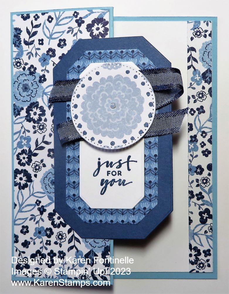
This Countryside Inn Z-Fold Card uses both the paper and the dies in the Countryside Inn Suite Collection, and the Z-Fold design just kicks it up a notch! I like to make Z-Fold cards because they are so easy and look like you really make something extra special!
The Countryside Inn Designer Series Paper has four colors of blue and white. For this card base, I chose Balmy Blue cardstock. To make the z-fold, make the card base as usual so that the front measures 5 1/2″ x 4 1/4″. On the front of the card, you will score down the center at 2 1/8″. Then fold the right edge of the card front back on itself. If you look down from the top, you will see the card base is in the shape of a Z. So basically, fold the front half of the card, back on itself.
To add designer paper (or a stamped design) to that folded back left side of the card front, cut the paper at 2″ x 5 3/8″. That gives that narrow margin. If you want the usual margin, cut the designer paper at 1 7/8″ x 5 1/4″. The inside is Basic White with a strip of the same designer paper along the edge.
To decorate the card, I used the Countryside Corners Dies. I cut the larger piece out of Misty Moonlight cardstock, but you could use Night of Navy or Boho Blue. The next layer is cut out of a different pattern of the same designer paper. For the center, I diecut a piece of Basic White.
For the center piece, the trick was to find a greeting that would fit a vertical piece like I had. However, I could have also stamped a greeting that would just go horizontally across the white center. The greeting is in the Charming Sentiments Stamp Set and is stamped in Misty Moonlight ink.
To decorate the top, I used a die in the Stylish Shapes Dies to cut out the big flower in another pattern of the Countryside Inn DSP. To jazz it up a little, I added the Night of Navy 3/8″ Bordered Ribbon back and forth behind it and popped it up on Stampin’ Dimensionals. I also added a tiny little pearl.
To adhere this center piece to the card, remember to only put adhesive on the left half that will be glued to the Z-Fold. Try to center it as much as possible. Then if you want to stamp a greeting on the inside of the card, try to hide it behind this piece.
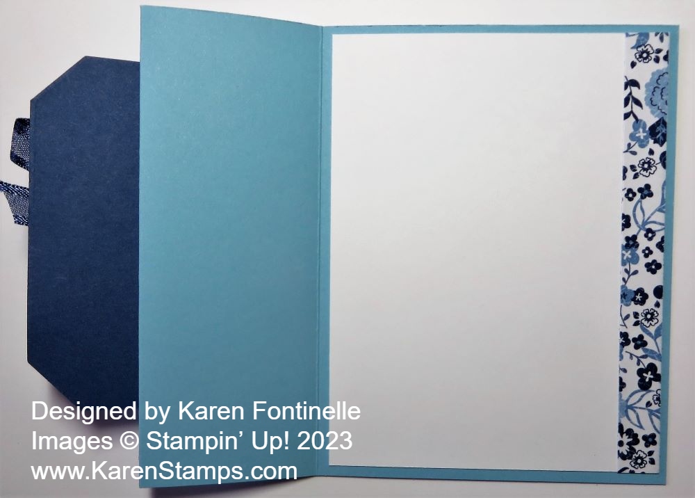
Here is what the inside of the card looks like.
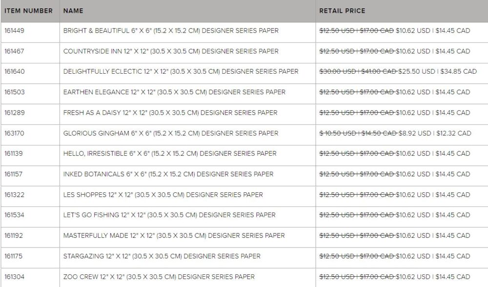
The Countryside Inn Designer Paper and all the papers on pages 130-132 in the new Annual Catalog are discounted by 15% during the month of June! Don’t let that sale slip by! You can search online under “Specials” on the top greenish bar.
When you think outside the blue box, you might come up with a Countryside Corners Multicolor Card like this one! If you are familiar with the new Countryside Inn Suite Collection, the Countryside Corners Bundle, or the Countryside Inn Designer Series Paper, you know the main colors are blue and white. There are four different colors of blue in this paper! As much as we like blue, sometimes it takes a shift in thinking to realize, “Oh, I could use some other colors besides blue to make cards with this set!”
With summer on the way, I thought I would look at some Stampin’ Up! color suggestions, and I chose to use Poppy Parade, Lemon Lolly, and Lemon Lime Twist, plus Basic White. Nice bright colors instead of blue….not that there is anything wrong with blue!
The card base is Basic White with a layer of Poppy Parade. Even though I have had the Countryside Corners Stamp Set all this time, I hadn’t used it yet! Actually, it is not a stamp set, it is one stamp! You might think that each design would be a separate ring in the stamp design, but it isn’t, which is a little perplexing at first. You can ink the stamp all in one color or you can use Stampin’ Write Markers to color each ring or border with a different color.
What you can do for these layers is stamp the whole stamp on different pieces of cardstock and then you can die cut each color in whatever way you like. For this card, I stamped the whole stamp with Lemon Lime Twist ink on Lemon Lime Twist cardstock. I also stamped with Lemon Lolly ink on a piece of Lemon Lolly cardstock. I used two dies to cut out just that single design of the Lemon Lolly cardstock, which is then adhered onto the Lemon Lime Twist large, whole stamped piece. I tried out a couple of things for the center but decided on stamping Poppy Parade ink on Basic White and die-cutting that centerpiece. Then I chose a greeting from the Sentimental Park Stamp Set and stamped it in the center in Poppy Parade ink. That center piece is popped up on Stampin’ Dimensionals.
For a finishing touch, I added a Lemon Lime Twist ribbon, found in the Ribbon Duo Combo Pack. I tied a small bow and attached it with a Mini Glue Dot. I think maybe some bling in the form of gems, rhinestones, or sequins might be fun on this card, but I was undecided! Sometimes you have to know when to stop when you are creating something!
If you have this Countryside Corners Bundle (stamp set and dies), try out some different color combinations and see what you can create!
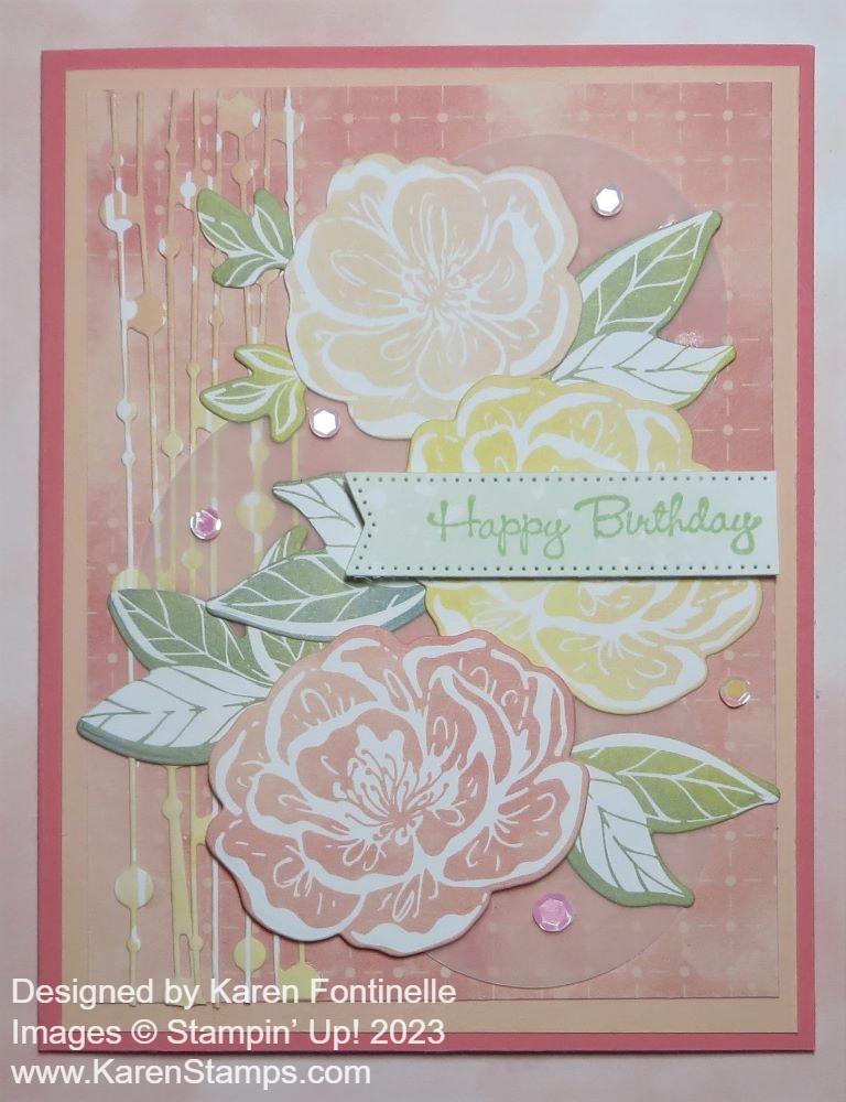
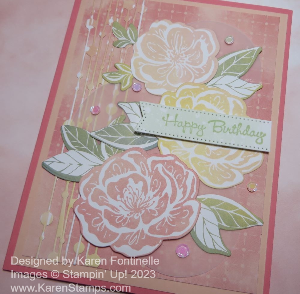
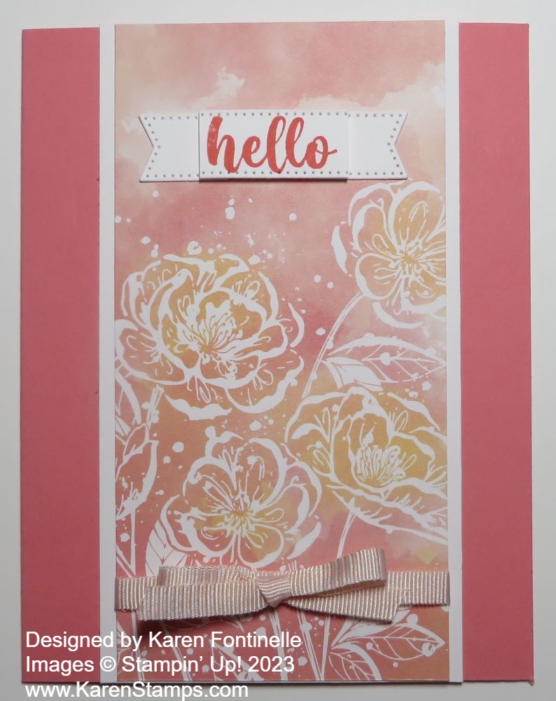
I seem to be quite taken with this paper lately, even though it’s not one of the brand-new products, but there is something about it! I made this Hello, Irresistible Floral Birthday Card mostly with die-cutting the elements on the card.
This is the Hello, Irresistible 6″ x 6″ Designer Series Paper, available as an Online Exclusive in the Stampin’ Up! Online Store. This means you won’t find the paper in the catalog, but it can be purchased online for as long as it is available. If you like this paper, you can purchase it at a 15% discount during the month of June on the Designer Series Paper Sale! The patterns are all so soft and pretty!
In making this card, I chose a card base of Flirty Flamingo, but I also added a layer of Petal Pink. I couldn’t decide which color to use so I used both! Next, there is a layer of designer paper. There are so many pretty patterns to choose from. I liked this color-washed linear design to be the background for the flowers.
What really inspired this card was the die-cut vertical piece on the left side of the card. I already had it in my pile of scraps that I didn’t use one other time, so I carefully adhered it to the card on those dots. You might not notice, but I decided to punch out some Vellum Cardstock circles, one with the 2 3/8″ Circle Punch and two with the 2″ Circle Punch. I put the largest circle near the bottom of the card and the other two above.
You can stamp flowers and leaves if you like from the Irresistible Blooms Stamp Set or you can die cut them right out of the designer paper! There are large and small outline flower dies plus a couple of different leaf dies. It is so fun when you can cut out the designs from the paper. Then I just played around with the flowers and leaves until I was happy with the placement and glued them down. The bottom flower is popped up on Stampin’ Dimensionals.
The greeting is stamped on a piece of designer paper in a Soft Sea Foam color in Soft Sea Foam ink. The greeting is in the Go-To Greetings Stamp Set. I used a narrow banner die in the Stylish Shapes Dies to make a thin banner for the sentiment without covering up too much of the flowers.
For a finishing touch, I adhered several of the Petal Pink sequins randomly on the card in the Pastel Adhesive-Backed Sequins. I really like these sequins, three different colors, and different sizes.
Here is another card I made using the Hello, Irresistible Paper.
Take advantage of the Stampin’ Up! Designer Series Paper Sale while you can!
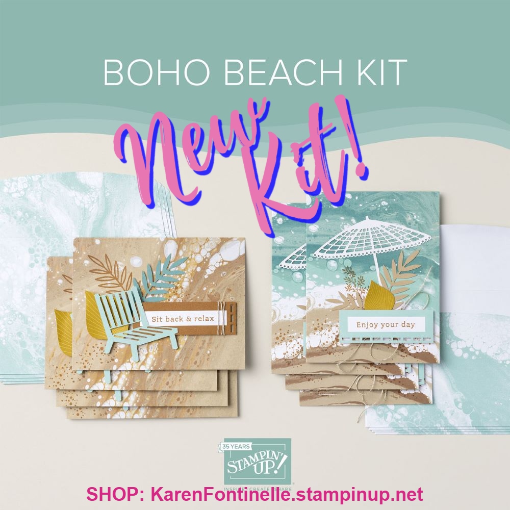
If you love the beach or are going to the beach this summer, you might love this new kit in the Stampin’ Up! Kit Collection! It’s called the Boho Beach Kit, and as you can see, it evokes images of the beach, the water, vacation, and relaxation……what more could you need?!
Did you notice the very interesting background on the cards? It’s an acrylic-poured paint art style that was used for a marbled color effect. My niece showed me some artwork she was doing with this method a few years ago and it looked so fun I wished I could have zapped myself right over there to play, too! You don’t have to make the background yourself, though, the cards are already printed with this design! Easy peasy!
DETAILS
This month’s kit includes:
Play with the new In Color, Wild Wheat, and try out one of the new Core Colors, Pecan Pie, plus a returning one, Lost Lagoon!
These kits are not the same as Paper Pumpkin Kits. Very similar in that they are kits, but Paper Pumpkin is a monthly subscription kit and you may or may not be able to purchase one later after it is mailed out. The Stampin’ Up! Kit Collection, however, is in the Stampin’ Up! Online Store and as long as they aren’t sold out, you can purchase them anytime. You can choose between Card Kits and Craft Kits.
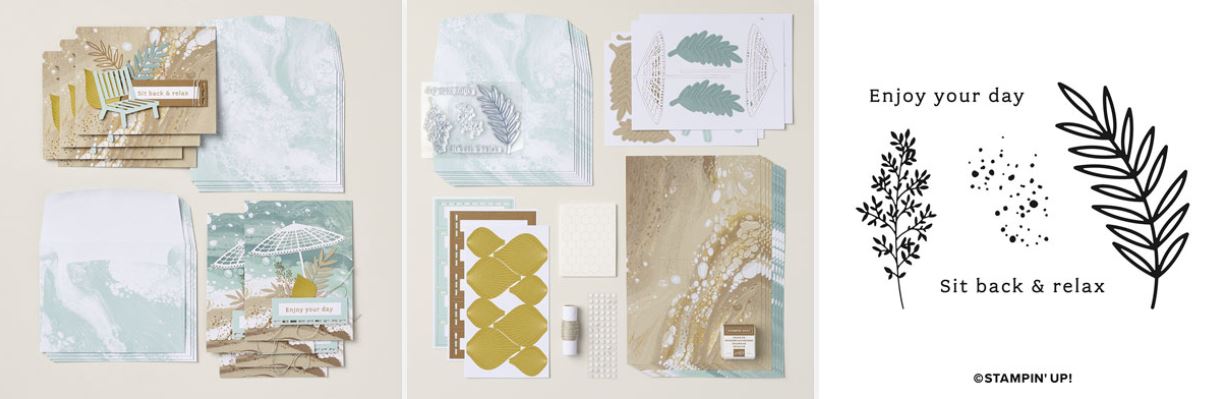
Watch Sara Douglass show the kit and how she makes her cards!
This Boho Beach Kit goes LIVE today so you can purchase it right away in the
Stampin’ Up! Online Store under Kit Collection.
Sometimes all you have to do is spy one of your scraps to get a card idea! That’s how this Hello, Irresistible Hello Card came about. I spotted a diecut scrap and was going to use the other side of this piece of designer paper, but when I turned the paper over, I decided to use this floral side instead! So you never know what you might come up with!
I used the Hello, Irresistible 6″ x 6″ Designer Series Paper on the front of this card. You might miss this paper because it is not in the new Annual Catalog. It is one of the Online Exclusives in the Online Store. The important thing is it is one of the select papers on the Stampin’ Up! Designer Paper Sale going on right now during the entire month of June! The whole package of 48 sheets of paper is very pretty. It has digitally hand drawn botanical and floral images plus color washes.
The card base is Flirty Flamingo. I decided to make the designer paper the full length of the card and center it so it is cut at 5 1/2″ x 2 3/4″. I thought it would be pretty to put a layer of Basic White cardstock behind it to accent the white images of the flowers, but I made it narrow. It is cut at 5 1/2″ x 3″.
Before adhering anything, I wrapped a piece of the pink ribbon in the Ribbon Duo Combo Pack around the bottom of the designer paper. I put it pretty low so as not to cover up the flowers. I tied a little bow separately and adhered it to the ribbon with a Mini Glue Dot. Then I assembled the card.
The greeting is stamped in Flirty Flamingo ink on Basic White from the Irresistible Blooms Stamp Set and diecut with a banner die in the Stylish Shapes Dies. Since I didn’t want the banner as long as it was, I tried an idea I saw recently. I cut off the ends of the banner and put Stampin’ Dimensionals on the back of the greeting. Don’t put them all the way to the ends so you have space. After adhering the greeting, I put Multipurpose Liquid Glue on the backs of the two end pieces I had cut off and adhered them flat on the card but slid underneath the popped-up greeting a little bit. That shortens the whole thing and just gives a little different look to your card!
Sometimes I don’t think about adding some sparkly jewels to my card until after I take the photo, but you certainly could add some Iridescent Rhinestone Basic Jewels to this card! That would be very pretty!
Don’t forget the Designer Paper Sale this month! Save 15% on select papers, and this is one of them!
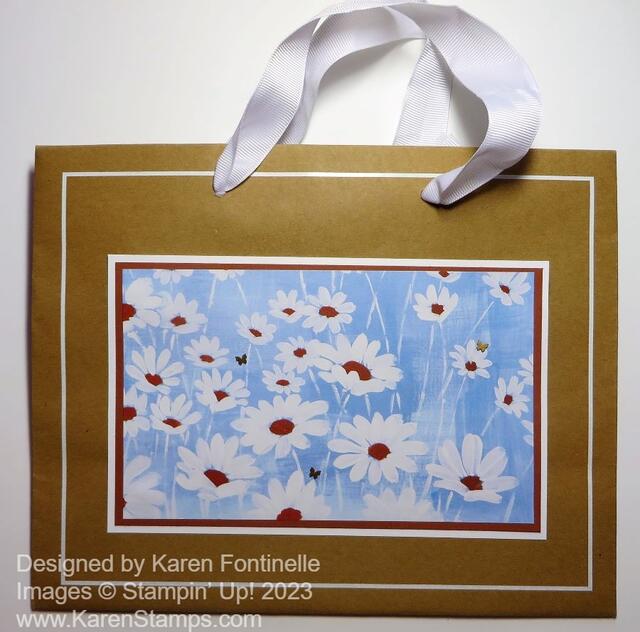
This is one of my favorite things to do with my stamping skills, making this Fresh As a Daisy Recycled Gift Bag! Actually, there isn’t even any stamping on this project and it probably only took me ten minutes are the most to make it. This is one of those quality shopping bags that I got at one of my favorite gift shops. Of course, on the front and the back it has the name of the store printed on the bag. But I love to take a shopping bag like this one I got from a store, and then decorate it and use it later as a gift bag. You can decorate it for any occasion. If every time you got one of these handled gift bags from a store, or even purchase a pack of them at the big craft stores, you stopped and decorated the front, covering up the printing, you will have a nice selection of gift bags that you personalized for a certain occasion or a certain person. It’s always handy to have gift bags in your stash for when you need one!
For this bag, I thought I would like to use the Fresh As a Daisy Designer Series Paper. I thought I would use the pattern with the green background and white daisies, but when I came upon this pattern, I chose it! For this bag, to cover up the store name, I cut it at 4 1/4″ x 7″. Of course, your measurements have to be appropriate for your bag.
I layered the daisy designer paper on a piece of Copper Clay Cardstock (one of the new In Colors). Because the handle was made with white ribbon and because of the white border around the edge of the bag, I decided to layer the designer paper and Copper Clay cardstock on a piece of Basic White Cardstock to help it all stand out on the kraft-colored bag.
For just a little embellishment, I added three of the Brushed Brass Butterflies flying around the daisies.
You could use any of the daisy patterns in the Fresh As A Daisy Designer Series Paper on a bag like this! Remember, Stampin’ Up! is having a sale on select Designer Series Papers during the month of June, so if you don’t have this summer Fresh As a Daisy Paper, or if you need more, be sure to order while you can get 15% off!

This Bright & Beautiful Just For You Card is just kind of a simple one, but jazzed up with the colorful designer paper! And a few sequins!
The Bright & Beautiful 6″ x 6″ Designer Series Paper is one that you want for making lots of fun and happy cards! It has festive patterns like confetti, stars, squiggly lines, stripes, and circles, but it also has ombre patterns and washes for softer colors. I chose this colorful pattern on the designer paper with all the different colors of these little diagonal markings. I cut it 5 1/2″, the length of the card, instead of 5 1/4″ and 3 3/4″ wide, just for something different with a little bit of margins on both sides to see the Azure Afternoon color. Looking through the scraps, I decided to cut a strip of designer paper in Azure Afternoon just to go across the middle of the card. Before adhering the designer paper to the card base, I wrapped around a piece of the Petal Pink ribbon in the Ribbon Duo Pack.
I used one of the new colors in the Stampin’ Up! Color Refresh, Azure Afternoon, for the card base after I had chosen which designer paper pattern I liked. So many colors to choose from! You’ll find the Azure Afternoon Cardstock in the Brights Family.
For the greeting, I decided to use designer paper for the tag, so I chose a Lemon Lime Twist colored paper on which I stamped the greeting in Azure Afternoon from the Sentimental Park Stamp Set. Then I diecut it with one of the tag dies in the Something Fancy Dies. I thought it needed to stand out a bit more so I die-cut a larger tag in Bubble Bath Cardstock. The greeting tag is popped up with Stampin’ Dimensionals. The bow on the tag is the Lemon Lime ribbon in the Ribbon Duo Combo Pack.
I almost always need some sparkle and pizzazz, so I added some of the Pastel Adhesive-Backed Sequins to the tag and to the card front. I’ve been using these quite often because the colors and sparkle are good!
Don’t forget, the Designer Series Paper Sale has begun at Stampin’ Up! and runs through the whole month of June! This Bright & Beautiful Designer Series Paper is one of the select papers on sale, discounted by 15%. If you already own it, maybe you need more! Check your stash!
SHOP STAMPIN’ UP! ONLINE HERE!

The Stampin’ Up! Designer Series Paper Sale begins TODAY, June 1st!
Stampin’ Up! is having a Designer Series Paper Sale on select papers during the month of June! It begins today, Thursday, June 1! Do you have your list made?!
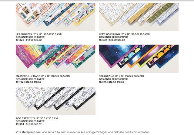
Notice that the big, 48-sheet pack of designer paper, Delightfully Eclectic 12″ x 12″ Designer Series Paper, is on the list!! It seems expensive, but you get a lifetime of paper at 15% off, so it’s a great deal! Interesting and different patterns, like pretzels, (one of my favorite foods), an alphabet, swans, ledger paper, flowers, stripes, everything!
The sale lasts all month, but don’t delay ordering your favorite paper to avoid those pesky backorder situations!
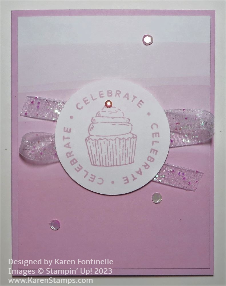
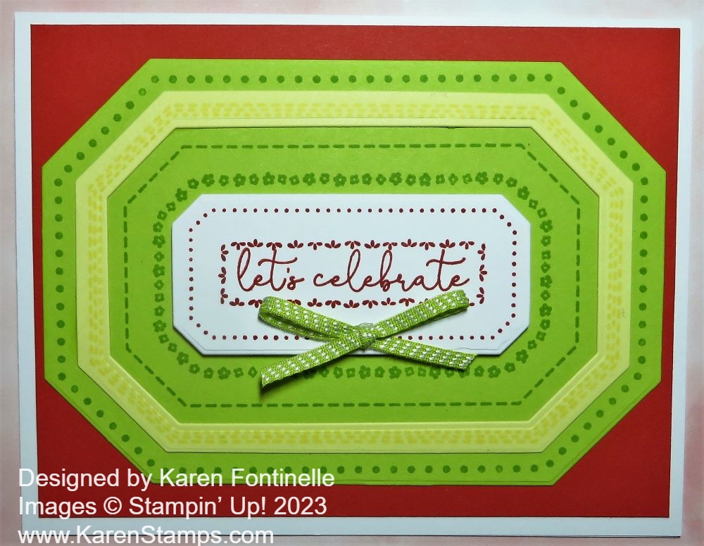
Here’s a quick and easy birthday card to make, the Bright & Beautiful Circle Sayings Birthday Card. I just chose a soft, ombre designer paper for the card layer and added one of the Circle Sayings.
The card base is one of the new colors, Bubble Bath. The designer paper is the Bright & Beautiful 6″ x 6″ Designer Series Paper. This pack of paper has all kinds of colors and patterns that will make lovely and bright & happy cards and projects for you. This particular pattern I chose has ombre shades of Bubble Bath. You almost can’t tell it very well in the photo. It’s like a dip-dye where each dip gets lighter and lighter at the top and darker at the bottom.
For the greeting, I used the Circle Sayings Stamp Set and the 2 3/8″ Circle Punch. You can purchase both together in the Circle Sayings Bundle and save 10%. I simply stamped the circular greeting in Bubble Bath ink on Basic White cardstock and then the cupcake in the center also in Bubble Bath. At first I wished the circle punch was a bit smaller so I could make a layer with the 2 3/8″ Punch, but the 2″ Circle Punch seemed a bit too small. I think it turned out okay the way it is.
To jazz it up a bit, I put some ribbon, back and forth behind the circle. This is the White 3/8″ Glittered Organdy Ribbon, which is still available in the Online Exclusives. Just put “organdy ribbon” in the Search box and it will come up. It is soft enough to go along with the soft colors of the card, but you can see the bits of glitter embedded in the ribbon for a little sparkle. As I got out some Iridescent Rhinestone Basic Jewels, I decided to color one with the Dark Bubble Bath Stampin’ Blend Marker and put it on top of the cupcake! I was going to put more rhinestones on the card but changed my mind to the Pastel Adhesive-Backed Sequins. I just chose three of them and placed them on the card. It adds a little bling but not too much.
This Bright & Beautiful Designer Paper will be on the Designer Series Paper Sale on June 1st at 15% off, so put it on your list if you don’t own it already!